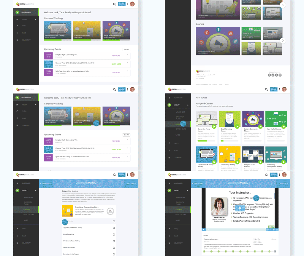
DigitalMarketer is an Austin-based company that creates content, hosts events and offers a subscription based e-learning platform to help marketing teams and marketing agencies learn about the ever-evolving industry of Digital Marketing.
As the UI/UX Designer, I was in charge of rethinking the entire User Interface and Experience for DM's proprietary e-learning platform: DM Lab. I was also to use my front-end development knowledge to help our dev team reverse engineer the app to include my design updates. I also designed and helped our Dev team build landing pages including their 2 biggest international conferences, and an online guide to Digital Marketing which continues to be their most highly trafficked website. In addition to creating wireframes, mockups, and prototypes, I also created graphics, animations and print assets to accompany DigitalMarketer's products and conferences (see The Ultimate Guide to Digital Marketing and DigitalMarketer Landing Pages).
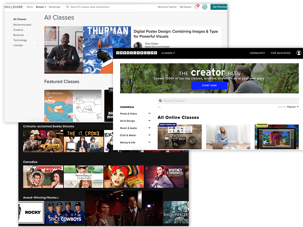

Our main users were Marketing Entrepreneurs and Agency Owners looking for specialized knowledge. Their main painpoint with the app was that it was difficult to find what they were looking for. Additionally, they were frustrated by the lack of in-app support and ability to view, cancel or change their membership. I looked to several specialized e-learning sites like Skillshare, CreativeLive, and LinkedInLearning for competitive analysis. In addition to addressing the user's painpoints, I wanted the experience to feel more familiar and customized, so I also used subscription-based streaming sites like Netflix and Hulu to find inspiration.
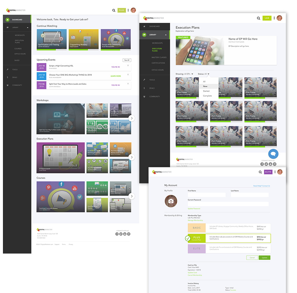

After looking at what competitors were doing to solve some of the painpoints our users were encountering, I created mockups with a new sidenav with fewer colors and more self-explanatory names and icons. I added a top nav with a global search bar where users could find and update their profile by clicking on their avatar. I created account settings pages and a user flow for in-app cancellations and upgrades. I also redesigned the homepage/dashboard and main index pages so that users could easily pick up where they left off and see featured content.
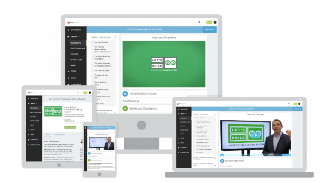

The biggest takeaway I had from this experience was to include mobile and tablet mockups and push for responsive development in each sprint. Because our Dev team was under tight deadlines to get the Designs implemented, the overall UI/UX was not improved for all screens. I also faced challenges in convincing decision-makers that removing the large colored hero section with a search bar specific to every page would actually improve user's ability to navigate the site. I learned a lot about how to present my designs to stakeholders that were married to existing designs and argue on behalf of the user to improve the overall experience.

tatejanek@gmail.com

512-940-4299