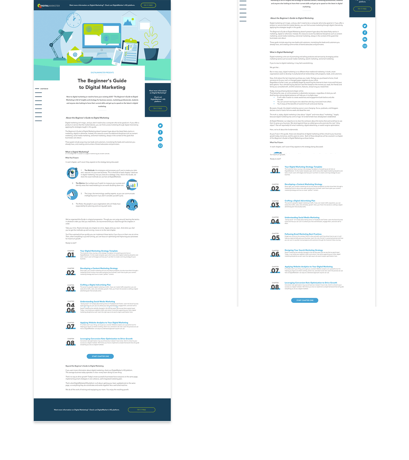
I was responsible for creating an interactive, on-line guide to Digital Marketing that would crate brand awareness, drive traffic to DigitalMarketer.com and serve as a lead magnet for DigitalMarketer Products and Events.
View Guide ↗Our Content team came to me with a 125+ page PDF Document that they wanted to convert into an extensive on-line resource. This resource would be free and available to anyone, but would ultimately serve as a lead magent for the DigitalMarketer Brand. As the UI Designer, I was charged with creating the entire digital experience including the styleguide, graphics, site navigation and page layouts. In addition to creating these assets and mockups for the index page, table of contents, and the interior chapters and pages, I also helped code and build the website. View Styleguide & Mockups
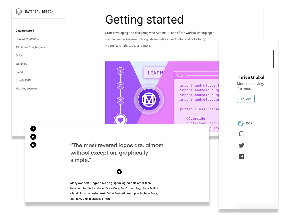

I looked to several competitors for ideas on how to make this longform text document easy and enjoyable to read. Many of the other longform marketing websites I found were littered with graphics and CTA's that distracted from the page content. I also noticed the only way to navigate around these sites was sequentially, page by page, or by returning to the index page. I liked the way Medium, DesignBetter.co and Creative Bloq used whitespace to break up their content and the way Google's Material.io introduced their guide with a "Getting Started" page and then kept the navigation anchored to the left side of the page on all of the interior pages. I also liked how easy it was to share from Medium and Invision's blog and thought this social aspect would increase traffic and engagement.
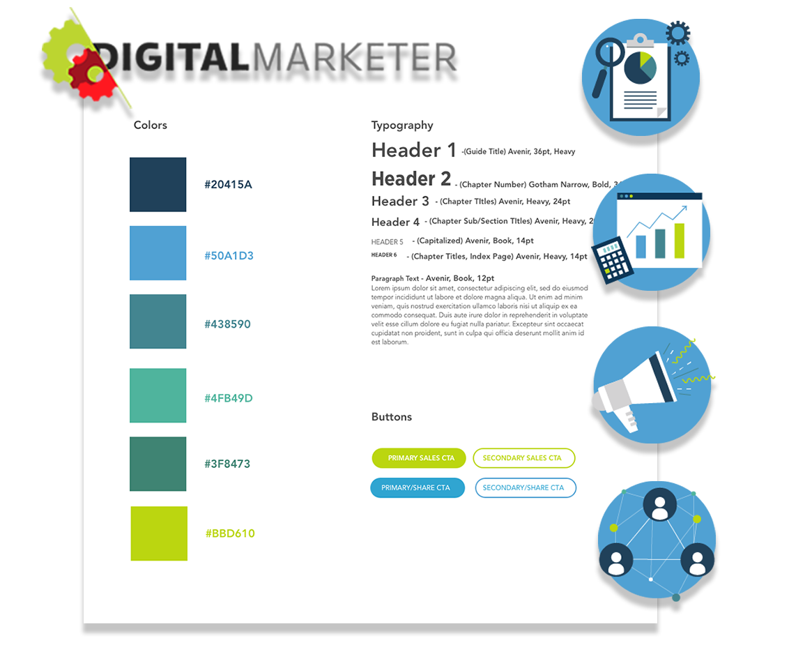

At the time of creating this on-line guide, DigitalMarketer's website used flat graphics, two very similar sans-serif fonts, and a color palette that included colors from all over the color wheel. The DM logo used a bright green and red so I chose to use the DM Brand green to define a more analgous color palette. I liked how DesignBetter.co's online guides used limited but impactful graphics and subtle CTA's that didn't distract from the page content. In order to stay on-brand with DM, but not detract attention from the guide's textual content, I decided to use just one font-family - Avenir, for the guide, and I kept a flat design style for the iconography.
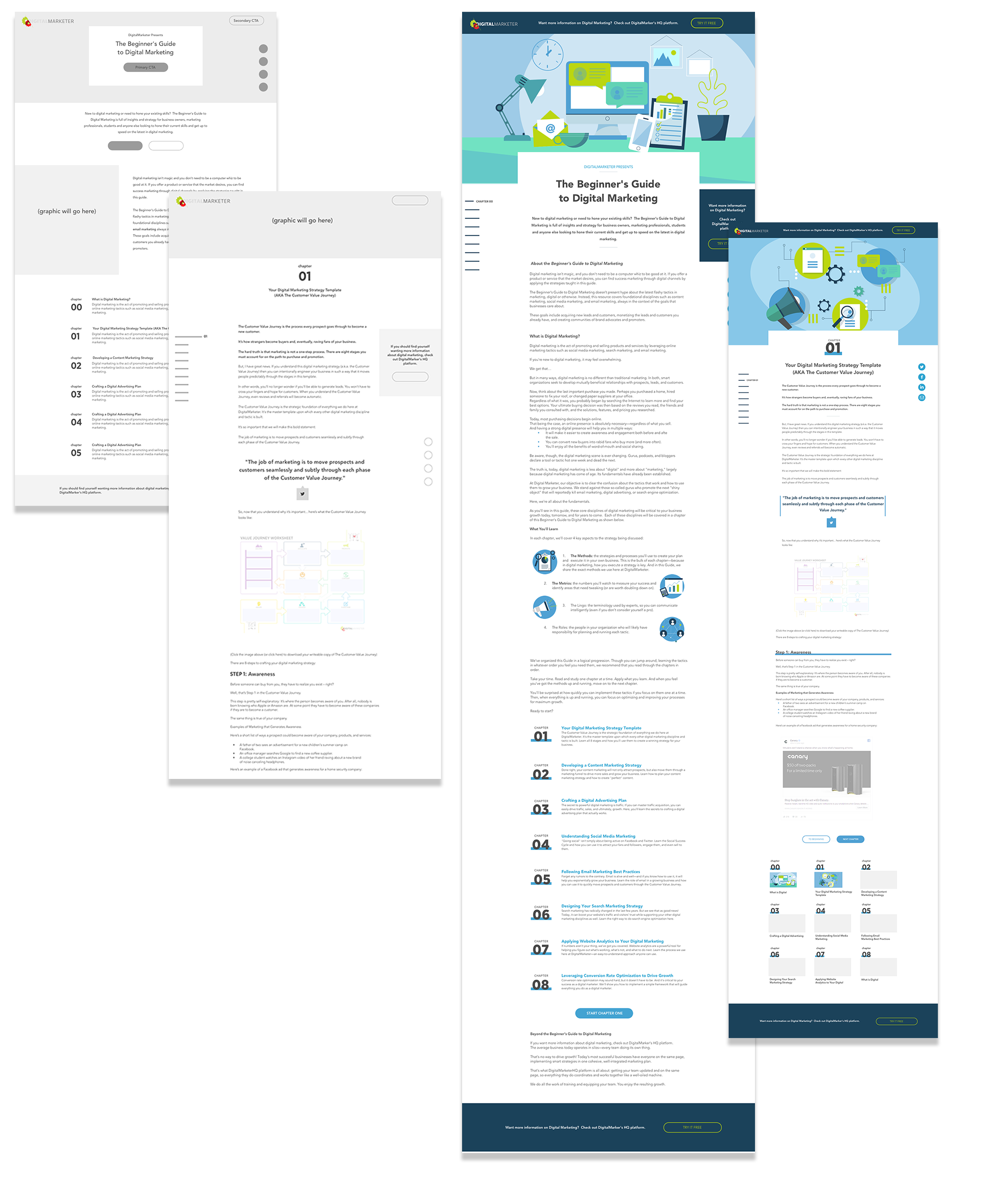

Before presenting mockups with content, graphics and colors to our content team, I created grayscale wireframes to show page layouts. I wanted to make sure they weren't distracted by new color combinations or graphics and were able to focus on the experience of navigating through and consuming the content. Once the wireframes were approved, I created hi-res mockups with graphics, icons and actual copy from the guide.
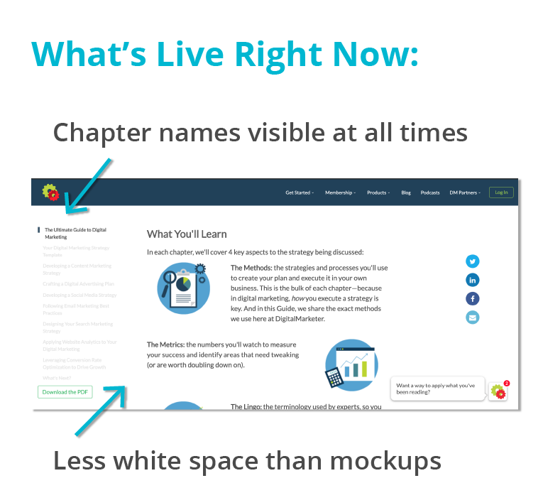

This guide continues to drive more Traffic to the DigitalMarketer brand than any other piece of content. While there have been minor changes to the graphics, spacing and styling of the side navigation, the functionality, architecture and layout of this site remain the same as the original mockups.
The guide has proven to be extremely user-friendly and engaging, however, one note that we received from users is that they wanted to be able to see chapter titles alongside all chapter tabs on the sticky sidenav. To avoid cluttering up the page, I suggested having the titles appear on hover of a chapter tab. However, our President decided that the chapter titles and numbers should be visible at all times on every page. I would like to see more white space on the live site and a child container that is centered so that the textual content didn't interfere with the content on the sides.

tatejanek@gmail.com

512-940-4299