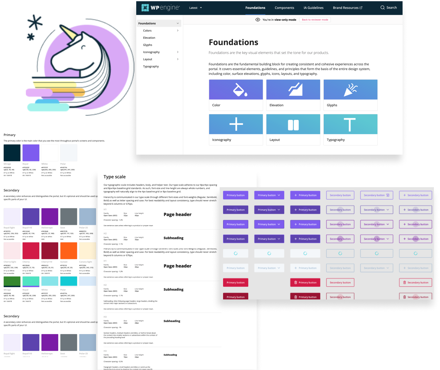
When I started working at WP engine, there were only three UX designers (including myself) on the product team. While we had a small Figma library of basic components, there were no guidelines or documentation regarding design standards, and best practices. Further, our engineers weren't using a shared component library to ensure consistency when designs were handed off to be built.
As our product team grew, I became an advocate for a scalable design system that included documentation, components and WCAG accesibility standards shared across product.
As the lead designer on Unicorn Design System, I was able to help take a very rudimentary design system and create a true, WCAG compliant system complete with a component library shared across design and engineering teams. I partnered closely with another Senior Designer and a team of front end engineers to ensure our component library was consistent across design and development and helped improve overall usability and understanding of our design system.

Initially, I worked with another Senior designer on Unicorn Design System to conduct a visual audit of our platform and find all of the inconsistencies in our UI. We then partnered with our UX research team to survey designers and developers about their use of UDS. From there, we conducted moderated interviews with designers and engineers to further gauge knowledge and use of the design system.
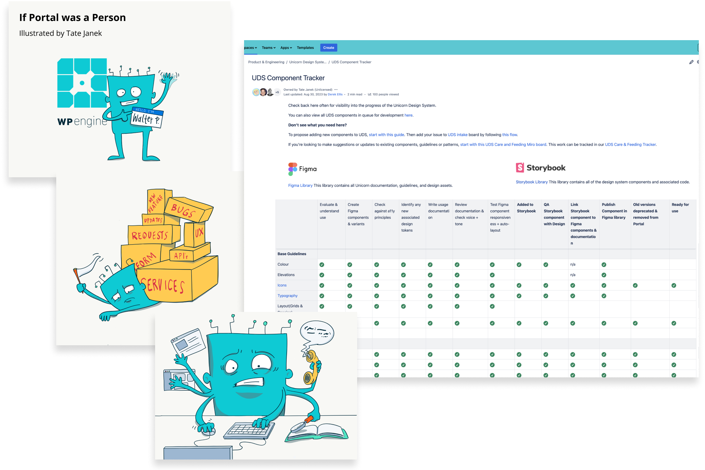
After the visual audit and research phase, we were able to identify the major areas for improvement in our design system. I worked with a PM to create an illustrated presentation called “If Portal was a Person,” to help sell the idea of an improved design system to key stakeholders and the rest of our product org. Additionally, I helped create a new design system wiki page and "componentt tracker" in Confluence. The tracker served a dual purpose in that it offered visibility into our progress, while also outlining the correct process for contributing to the design system.
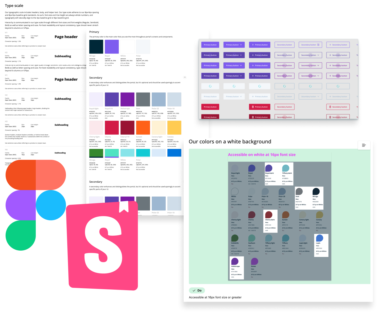

After gathering and analyzing feedback and collecting inspiration from other design systems, we began designing the design library, starting with foundations (like color, typography, accessibility etc.). In addition we created guidelines and documentation as we build out our core components (buttons, dropdowns, text input fields, etc.). We looked to other design systems like Material, IBM’s, Salesforce Lighting Design System, and other popular UX resources like WCAG and Nielsen Norman Group.
We also made it priority to ensure guidelines and components were inherently accessible. That is, components were built with correct ARIA labeling and default states of all components met at least AA color-contrast requirements. We collaborated with our engineers to make sure every “published component” was hyper-linked to their component library, using Storybook. Thus, every Storybook component was hyperlinked to Figma and visa versa so that designers and engineers had visibility into the consistency across the design assets and the actual components being used to build in portal.

After our core components were built and published for both design and developer use, we were able to send out follow up surveys to designers and developers to gauge overall use and satisfaction. While scores were immensely more positive that original survey, we were able to determine a few more pain points and establish next steps for improvement. One major painpoint we had was the decentralization of the Design System. Non-designers and developers had a difficult time switching between Figma and Storybook--two programs that they weren’t frequently using. Additionally, it was difficult to search using keywords for the correct guidelines and components.
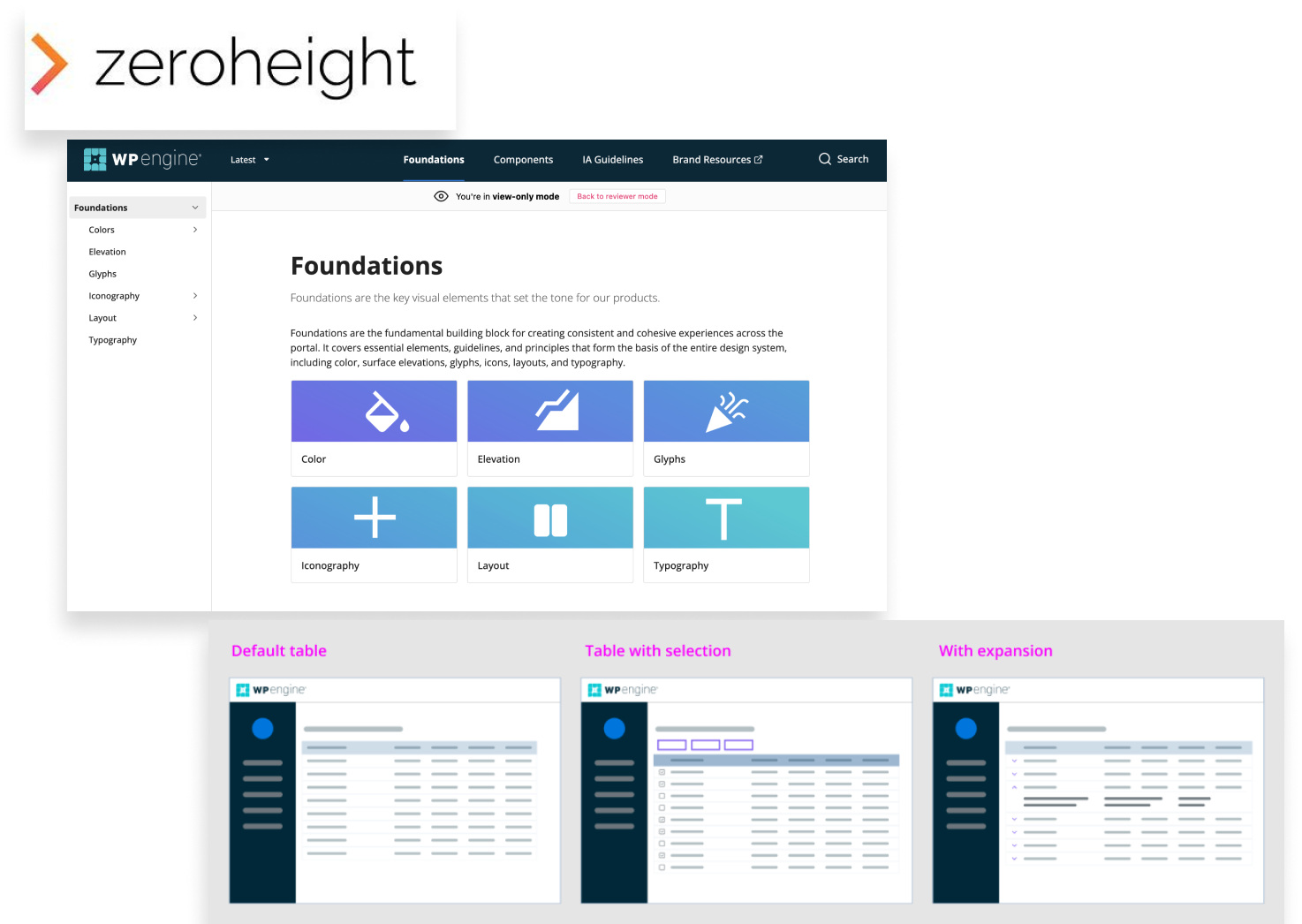
Thus, we determined that the next best step was to use a tool like Zeroheight to create a more central, easily sharable system. We also found there was a demand more complex components like tables and page layouts.
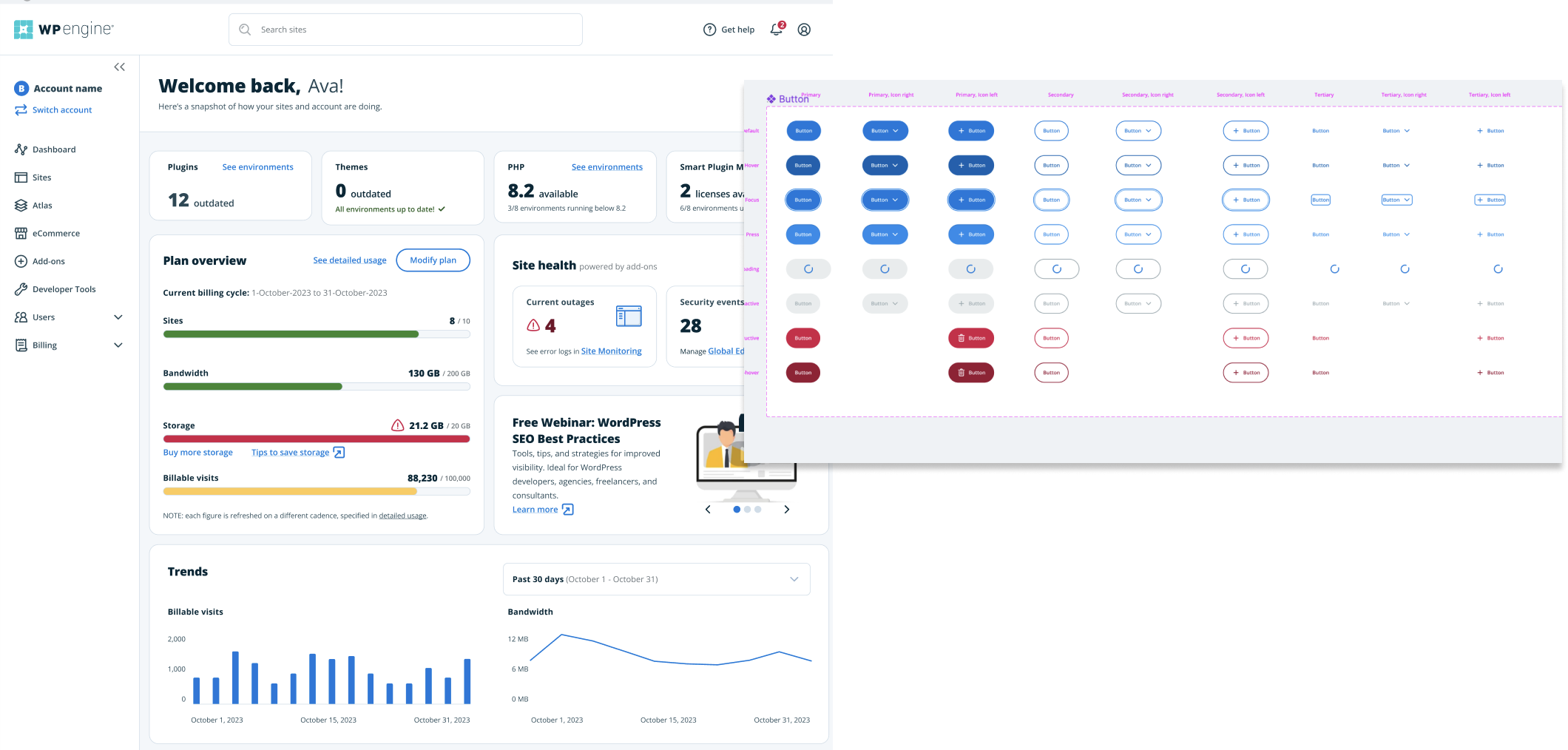

The work on UDS 3.0 laid the groundwork for a design system that could grow and change with little dev lift. We were easily able to give our product a complete makeover using our design system (as pictured). Further, the onboarding for both designers and developers designing and building for portal became much easier with little room for error or inconsistency. New designers and developers are able to ramp up and start designing and building faster, and our customers have expressed their appreciation for an overall more cohesive product experience.

tatejanek@gmail.com
512-940-4299