SwimATX is a responsive website and online community for Swimmers and Triathletes in Austin, Texas to find pools, train, and connect. I designed and coded this website and created the logo and all graphics for a final project in school.
The city of Austin operates 51 public pools and splashpads, but there is no central source of information for swimmers to find information and view pictures of Austin's public pools online. The challenge was to create a site that showcased the best public pools to swim laps in Austin that offered an inviting, informative, and interactive user experience.
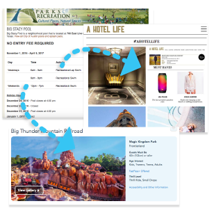

I started by identifying the problems with the current City of Austin website and the other informational websites featuring Austin city pools. For the modern, interactive feel I referenced travel sites and revenue-driven tourism sites like Disney, Airbnb and HotelLife for inspiration. Keeping in mind the design goal to foster an online community, I looked at online communities for athletes like Mapmyfitness and bikepacking.com.
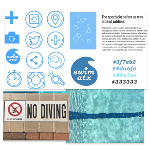

Using sites like Disney and bikepacking.com as well as real-world images and colors for inspiration, I created water-themed illustrations and iconography to give the site a sense of cohesion and playfullness.
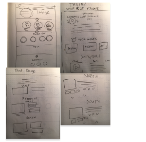

With the user persona and story in mind, I sketched out the four main pages a user might visit on the site. First, a homepage with an aerial view of the site, a "main" pool page with a map of the city and the various pools in each region, a "regional" pool page featuring specific pools with descriptions and pool images, and a "training" page offering free training resources and workouts. I decided to keep the same top navigation across the site so that users could easily navigate between pages.
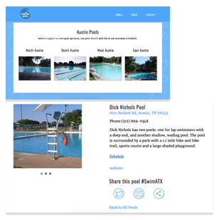

At first I aimed at giving more priority the communal aspect of the site and placed emphasis on integrating social media and share features. However, after a few user tests, I realized people were mostly navigating to the information on pools and training resources. Images were also a huge attraction for users, so I gave visual heirarchy to pool images and the share and "connect" elements on the site were given less priority and tucked away to the side or located at the bottom of content.

tatejanek@gmail.com

512-940-4299