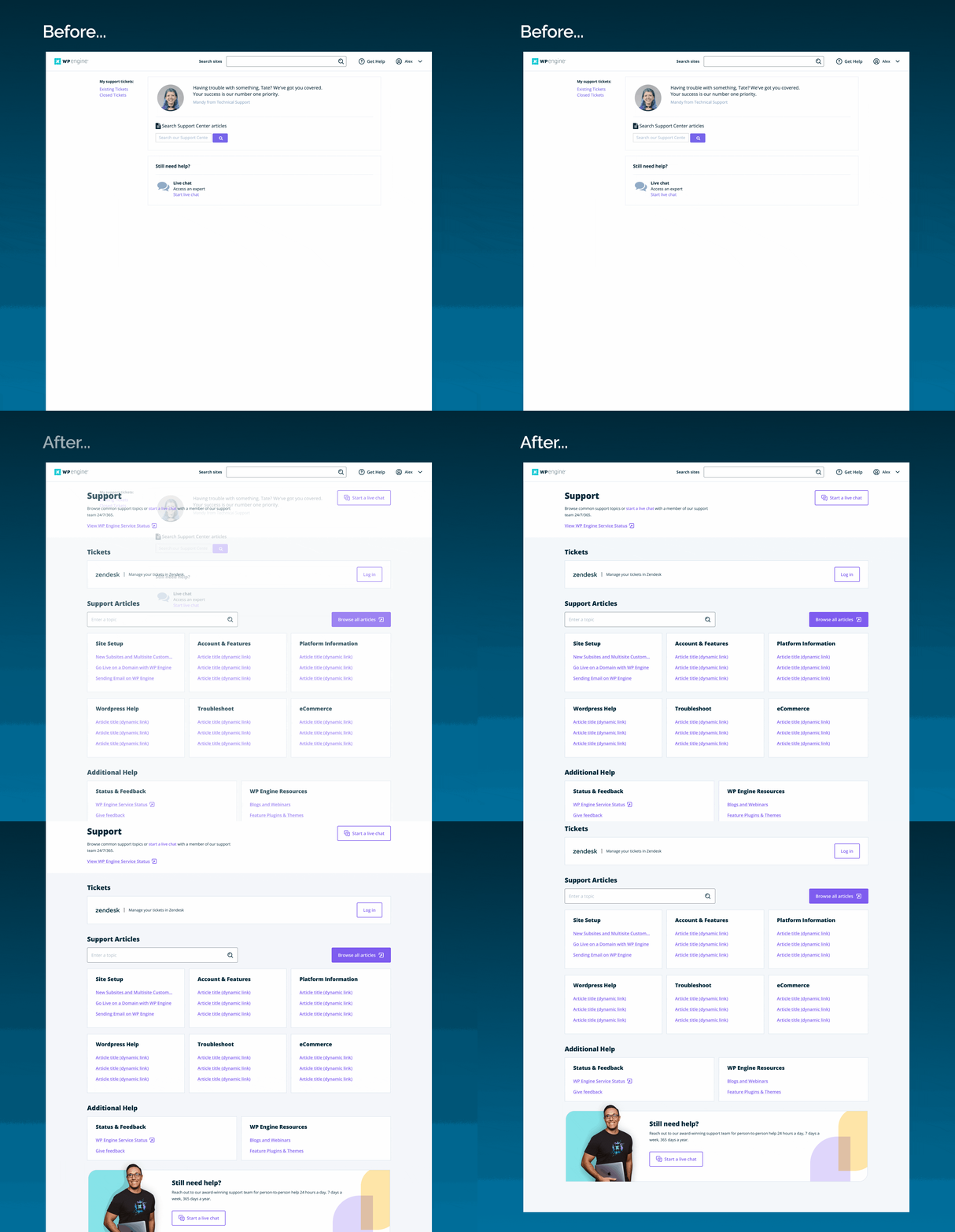
24/7 access to our Customer Support team was a key reason customers chose our product over other competitors. However, our in-app support center was a page created by engineers and had never been revisited by design. As the first designer tasked with redesigning this area of our product, it was important to me to take a holistic approach and look at how this page fit into the overall Customer Support experience.
As the first designer to rethink this area of our application, it was important for me to involve the necessary stakeholders. To kick off the project, I met with the Product Manager, engineers, and members of our Customer Service team for a design-thinking workshop. I was also able to partner with research to test early concepts and lo-fi designs.
In addition to improving the in-app support experience for our customers, my job as the designer on this project also meant ensuring that we wouldn't be adding to Customer Support inquiries.

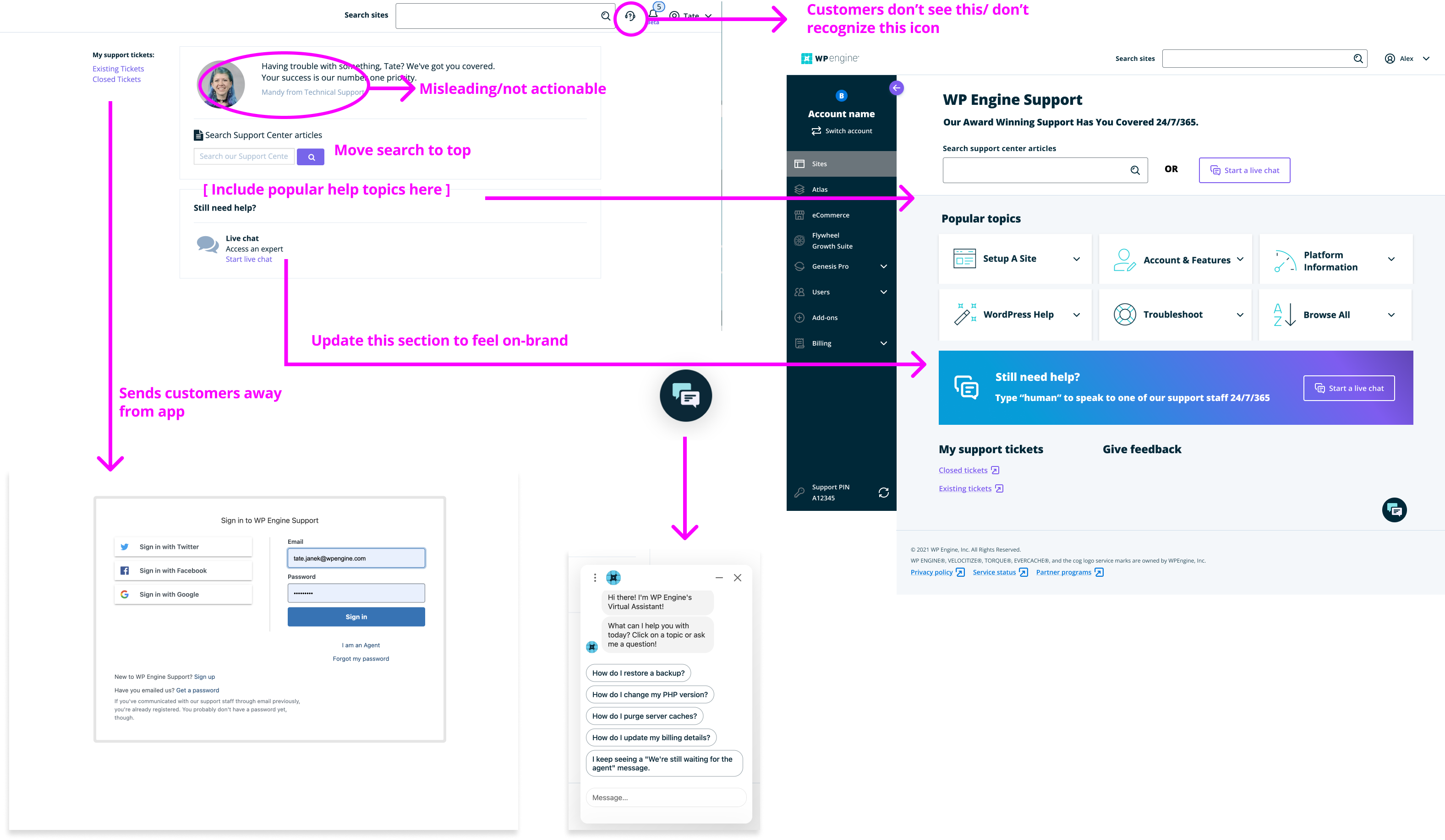
By partnering with our UX Research and Customer Support teams, I was able to gather qualitative research in the form of customer feedback for our end users as well as our internal users (our Support team). With quantitative data from heat maps and behavior tracking tools, I was able to better understand how users were interacting with our Support page as well as our chat-bot. I learned that many customers preferred to self-serve rather than have to contact support in the first place--which was virtually impossible to do within the app.
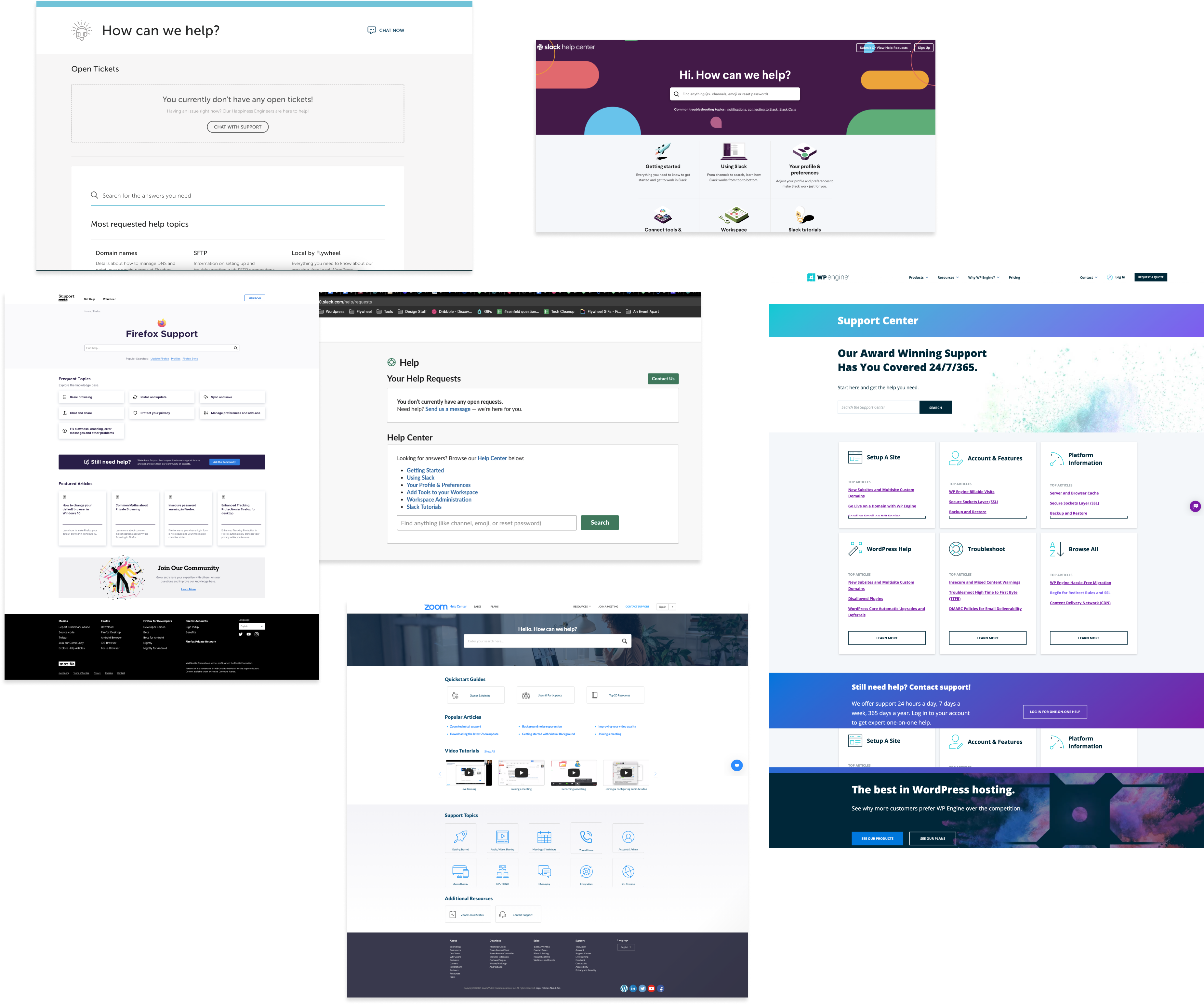
I then looked at competitors and gathered inspiration from other in-product support experiences. I found that unlike many of our competitors, our support page felt off-brand and detached from the product experience. Thus, I determined this redesign needed to not only reduce friction for customers trying to get in-app support but also help increase trust/visibility of support resources within our product.

The first design decision I made was to update this page with design system components and patterns that matched the rest of the product experience. In order to offer a consistent experience, I updated typography, individual page components and imagery to give the page a more updated, on-brand look and feel.
A simple heuristic evaluation of the original page helped me identify room for improvement in things like content and page layout. For example, a lack of visual hierarchy made the page feel unorganized and difficult to navigate. I decided to give more visual prominence to actionable items like search, finding/creating support tickets, and/or starting a live chat. In order to surface helpful information and reduce cognitive effort for users that wanted to self-serve, I partnered with engineering to make this page dynamically populate our most popular support topics.
Finally,a simple icon change and adding the words "Get Help" to the navigation, also helped with the discoverability of this page.
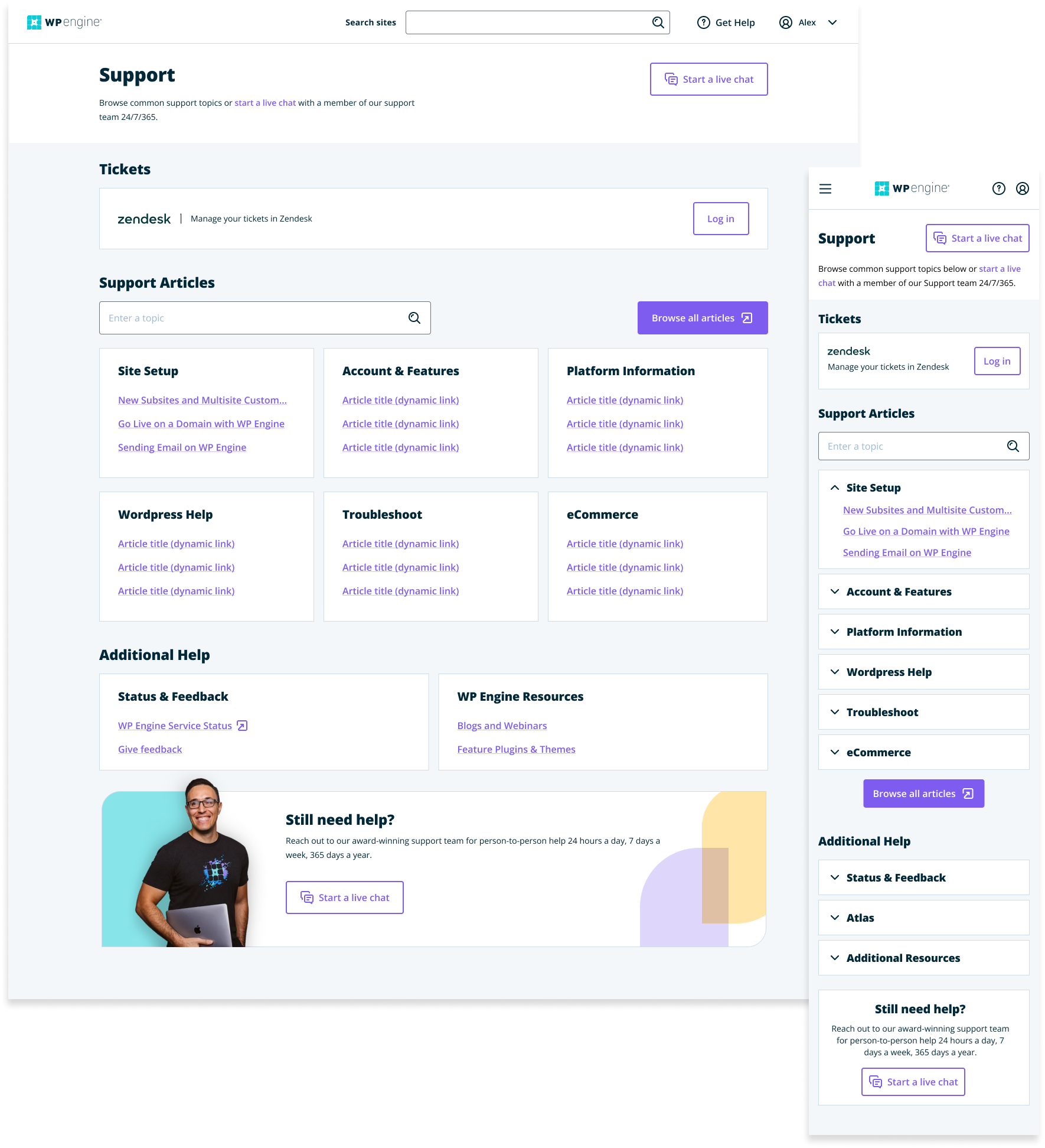

This page went through several rounds of testing and iteration. In addition to customer satisfaction with the redesign, it was important that our Support Team also approve of the updates. In initial designs, the "Start a live chat" button was a primary, filled button. Initial designs also included supporting text to explain that by typing "human" into a support chat, a human would be able to chat with them 24/7. Fearing that these changes might create more of a burden on our support team, we ended up making the "Browse support articles" the primary CTA on the page, and removing any references to humans in our supporting copy.
Unlike the original Support page, this page was responsive, however, the rest of our app was not responsive, so it was hard to determine how useful this was to customers. Another piece of customer feedback I would have liked to explore further was the ability to see open tickets on this page. Due to time and technical constraints, integration with our ticketing platform was not a priority, but it was on the roadmap when I left WP Engine.

tatejanek@gmail.com
512-940-4299