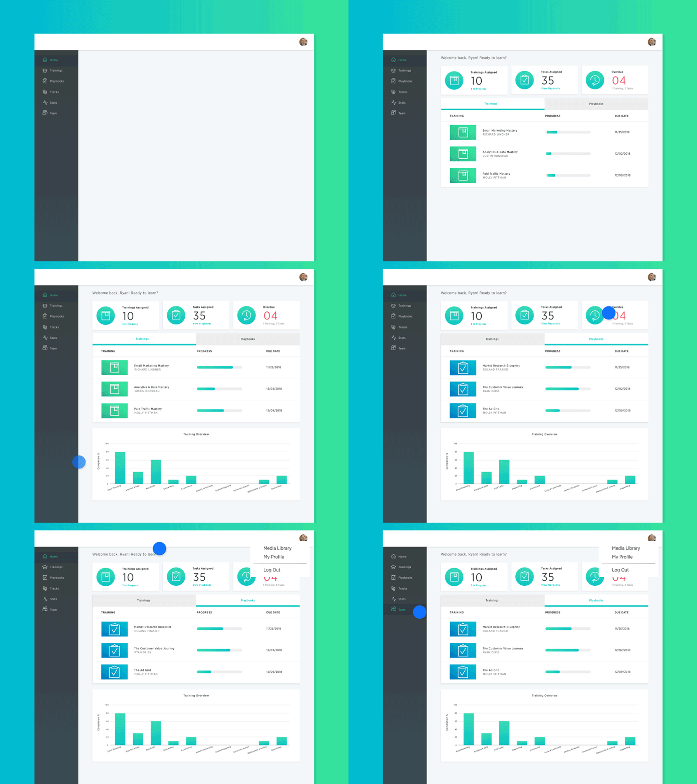
I was the lead designer at Praxio, a sister company to DigitalMarketer and Saas product. Praxio is a "Knowledge Management Platform" aimed at simplifying the process of sharing specialized knowledged within an organization. This enterprise application could be described as a company wiki where users can freely upload, customize and exchange resources and managers can easily onboard and train employees. In addition to leading the design of this application, I was also tasked with designing the Praxio.com website and affiliate pages.
View Praxio.com ↗As the only Designer on the Praxio team, I was able to play a part in every aspect of designing this product. In addition to heading the UI/UX Research, Design and Development of the application, I created the Praxio styleguide, custom graphics and icons, animations, company mascot, onboarding, and emails. I also designed and helped build the Praxio.com website where users were able to learn about the app, its pricing and its features.
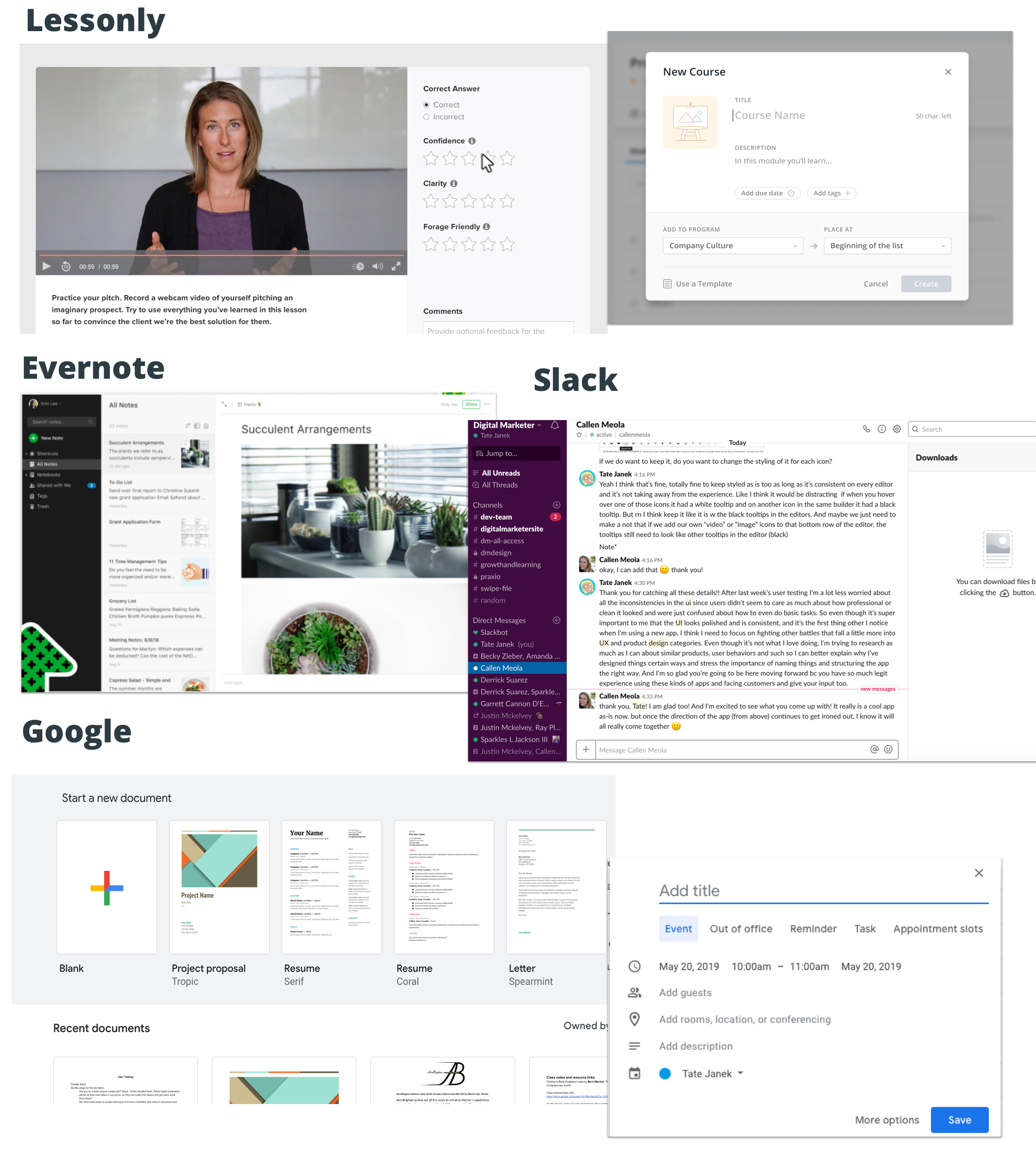

The original vision for Praxio was an e-learning platform for companies and business owners to upload customized trainings and processes and then track their employees. In this phase, I looked to competitors like Lessonly, Guru and Evernote for ideas on creating video trainings and quizzes. I looked at the different dashboards and reporting for instructors and learners. However, as we interviewed and tested more users, Praxio grew to become a file-sharing and social platform, in addition to e-learning. In this phase, I began to look to competitors like Google Drive, Dropbox and Slack.

When considering the UI and the branding for Praxio, I designed screens to meet the needs for the 3 main user types:
1)Super Admins - business owners and executives that purchased the product for their teams
2) Admins - managers and team leads uploading and assigning content and tracking team progress
3) Basic users - team members who would be consuming content and occasionally uploading content.
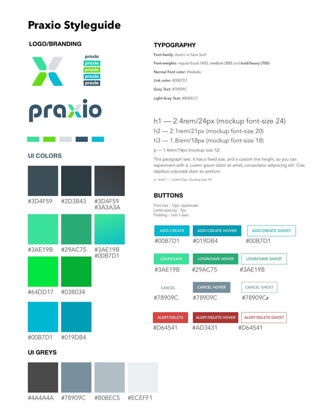
Since the latter two users would be using the app more frequently, I wanted the UI to be inviting and intuitive, but still professional. To acheive this, I used plenty of white space and icons so as not to seem cluttered or overwhelming. I chose analgous colors for the logo for the app UI to keep the app on-brand and I used gradients (when appropriate) to add a bit of depth and differentiation. In accordance with the the fresh, modern look and feel of the app, I chose Avenir as the primary font family and used Google's Material Design principles for element design.
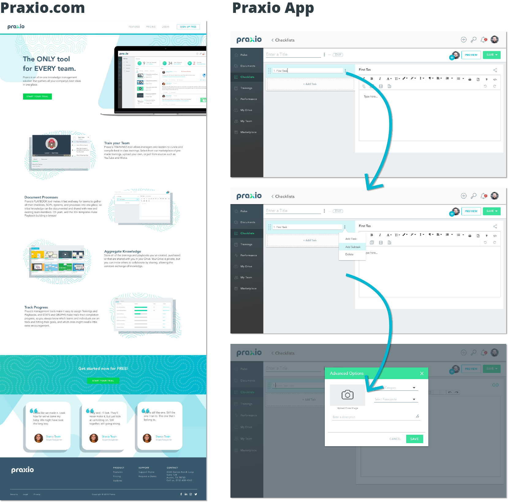

I created two Sketch files for Praxio. One file for the Praxio website, and one for the Application, which contained all the mockups and prototypes of the application's UI. Not surprisingly, the latter Sketch file was quite large and included several pages for each part of the app. I would typically create lo-res mockups to demonstrate user flows, and once approved, I would create hi-res mockups and working protoypes of a feature within the app.
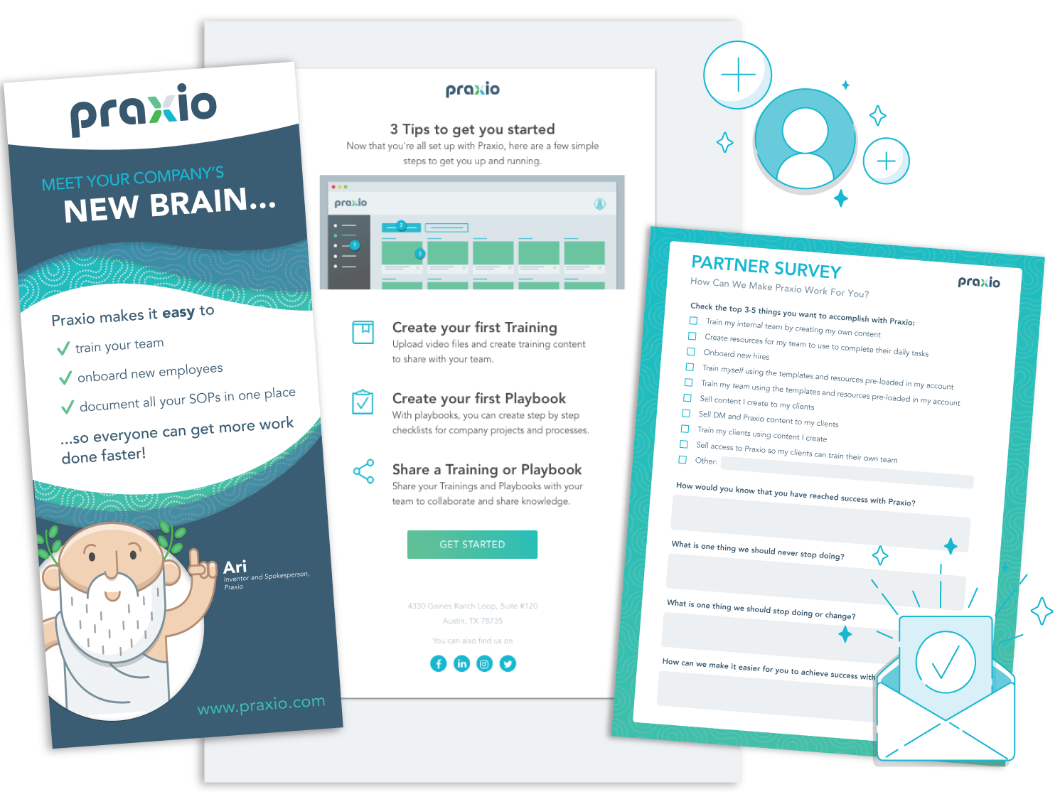

As the only designer on our team, I was not only responsible for creating the mockups and prototypes for Praxio, but I was also responsible for designing and creating our mascot, custom icons, graphics, animations as well as the mockups and assets for email campaigns, onboarding, and Praxio.com. I also designed all print assets like t-shirts, banners and trade show displays.
Because I was responsible for mapping out user stories and interactions, I was also responsible for conducting User Research and Testing. After testing with working prototypes and the Beta version of our app, I put together this User Test Report and presented it to stakeholders. As a result, I was able to convince our CEO to remove a feature called "My Drive" and simplify the content publishing process.

tatejanek@gmail.com

512-940-4299